- Fri 15 January 2021
- misc
We just got an Apple Silicon Mac Mini. It comes with, and only runs, macOS 11 "Big Sur".
Early assessment is that Apple has upped their game in terms of destigmatizing disabilities. Even people with normal eyesight are well advised to open the "Accessibility" control panel in order to make the new UI tolerable without squinting.
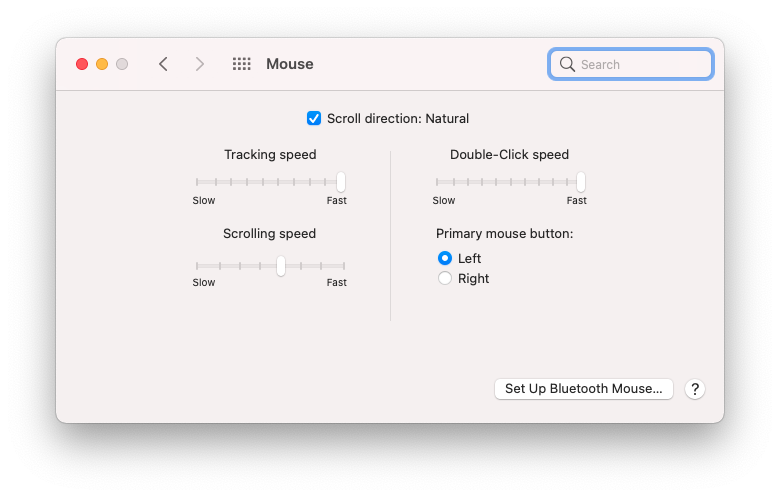
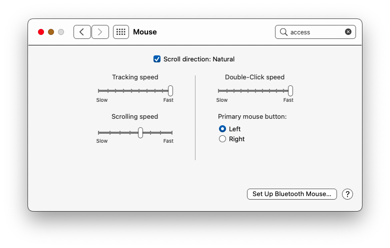
In the "light" theme, which most closely mimics traditional macOS color choices, if you want to easily see the controls on sliders and certain other UI elements, you probably want to select "Increase Contrast" in the "Accessibility" control panel.
Before:

After:

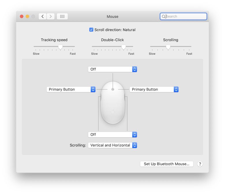
For comparison, the mouse control panel under 10.15.7 Catalina (with a different model of mouse):
Catalina:

(h/t to Gaige for the clue)